Creating a notification banner
Custom notifications are a common requirement for custom Zendesk Guide Help Centers and can be used for a variety of purposes. For example:
- Service providers may wish to display a notification to visitors when there is an outage.
- Retailers may want to highlight recalls or pricing changes.
- Event organizers may need to communicate changes to large events.
- And the list goes on…
This post describes a best-practice approach for creating a versatile notification system that’s easily to manage and supports multiple languages!
Update your page template
The first step is to update your page template. Most notifications appear on the Home page, which we will assume for this example.
<div class="alert hidden">
  <div class="alert-content">
    {{dc 'hc_notification'}}
  </div>
</div>
Where {{dc 'hc_notification'}} is a reference to a dynamic content snippet which defines the content of your notification. The snippet can include additional HTML and can be translated into multiple languages if you support customers in many regions.
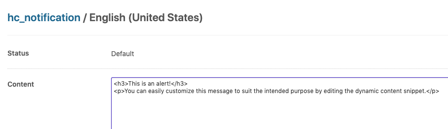
The dynamic content should only be created once. When you don’t want the notification to appear, simply add “#” to the start of the snippet. If you need multiple, independently configured notifications, you can create multiple dynamic content snippets for use in your HTML.
Update your CSS
Next, you’ll want to customize your theme’s stylesheet to give your notification it’s desired look-and-feel. For example:
.alert {
  display: flex;
  padding: .5rem 2rem;
  margin: 2rem 0;
  background-color: #f6faff;
  border-radius: 0.25rem;
  border-left: 4px solid #61a5ff;
}

.alert-content {
  overflow: hidden;
}

.hidden {
  display: none;
}
Importantly, the notification should be hidden by default using a class name. In this example, .hidden is used. This class name is then removed by the code in the next step, and the notification revealed, if there is valid notification text to display.
We’ve chosen .alert to ensure that there’s no conflict with the default .notification styles provided by Zendesk.
Add the required JavaScript
The custom JavaScript code required to conditionally reveal the notification can be added into your theme’s script.js file.
(function() {
  document.addEventListener("DOMContentLoaded", function() {
    var alerts = document.querySelectorAll('.alert');

    // Reveal each notification if the content doesn't start with "#"
    Array.prototype.forEach.call(alerts, function(el) {
      var text = el.innerText.trim().substring(0,1);
      if (text !== '#') {
        el.classList.remove('hidden');
      }
    });
  });
});
You’ll notice that the functionality does not rely on jQuery or any other JavaScript library.
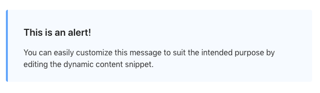
With those three parts in place, you can view the end result:
An alternative
This post describes the steps required to create a custom notification component. The need to define new CSS classes and write custom CSS can be avoided if you use a theme based on the Zenplates Zendesk theming framework.
It allow you to copy-and-paste resuable Zendesk theme patterns from their ever-growing Pattern Library (or other themes in their collection) directly into your theme, making adding custom functionality like this easily than ever.